
It’s now a quarter of a century since Prospect was founded and the first issue of the magazine appeared on newsstands. Over those 25 years we have remained committed to many of the same fundamental things: above all, to give space to serious writers and thinkers to make sense of the great issue of our times.
From time to time though, things do change. The look and feel of the print magazine today is quite different from the appearance of issue one, and of course the way that many of us consume journalism has been transformed by the internet. More people now read Prospect each month online than do so in print, and our audience there has been rocketing, almost doubling in the last 12 months alone.
And from today, we are launching a new easy-to-use and elegant website, so that the quality of our writing is at last matched by the experience of reading it online. The key aim of this redesign has been to help you, our readers, savour the writing you love without distraction.
Everyone can read a sample of pieces each month, and it is then extremely easy for subscribers to log in and enjoy unlimited access—all you need to do is enter the email address with which your subscription is registered: that’s it.
Everything starts with the letters themselves, so we’ve taken the chance to match the typefaces we use online to the ones that appear on Prospect’s printed pages. Alongside this, the text is larger and more generously spaced, making for a clearer and more enjoyable reading experience.
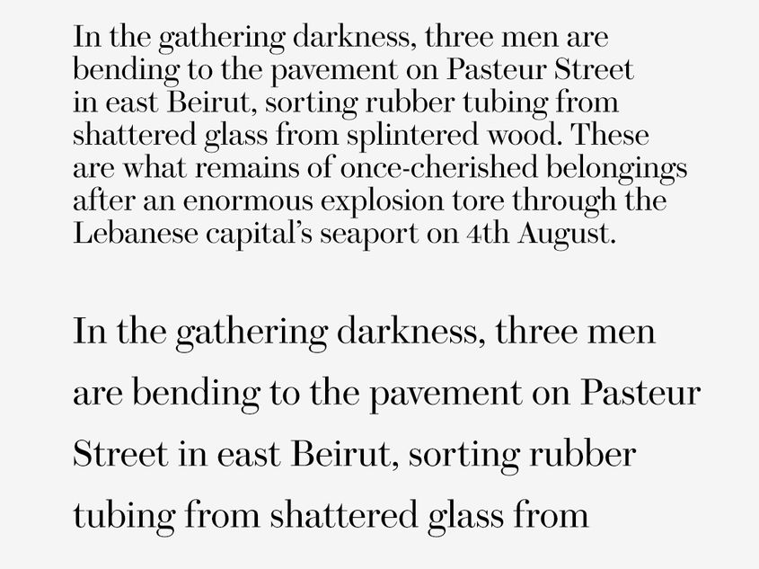
As part of the general decluttering, the website also has a cleaner appearance: more white space, a restricted colour palette and generally fewer distractions. Throughout, the emphasis is on allowing you to focus on losing yourself in our great writing—and particularly the long-form essays for which we are best known.
Indeed, a new dedicated “long-form” template allows you to enjoy deep dives like Timothy Garton Ash's survey of the state of liberalism and its path forward, or Cal Flyn's powerful argument for a new way of writing about climate change in a way that’s just as easy and enjoyable as flicking through magazine pages, and in a format which will for the first time allow proper digital space for the outstanding work and arresting images that adorn the print magazine.
You’ll also be able to find Prospect’s best writing from the last 25 years in the archive with greater ease, utilising an improved search function that indexes our website rather than embedding a third-party search function to deliver results that might not be relevant to key search terms.
And since ever-more of you are now reading Prospect on mobile devices, we’ve developed an even simpler, responsive version of the new website that is a joy to scroll through on your phone or tablet.
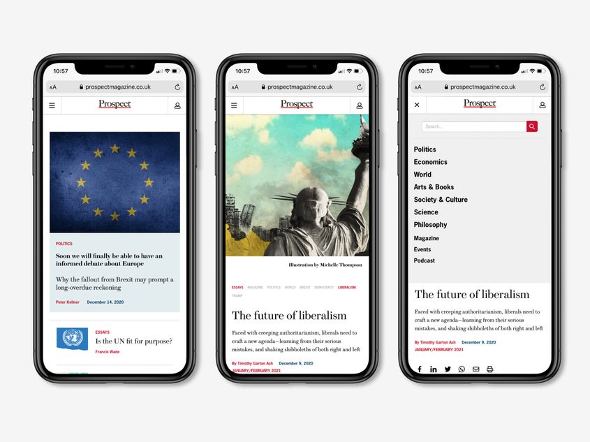
Meanwhile, behind the scenes, we’re changing the way we curate the content, grouping stories more logically, so you can easily find the topic, writer or story you’re most interested in. In the top-left corner, there is a menu (or “burger”) icon which calls up a list of the most important broad themes as well as some of the subjects that are leading the news agenda. You’ll also find important key words related to a story above the headline, giving you quick access to related content.
We know that this new website might take a bit of time to get used to, but we hope that all of these changes will combine to give you, our readers, a greatly improved digital experience.


